






A logo is a brand’s most noticeable element. You find it on websites, social media, business cards, packaging, and even on signs, among many other places. An excellent logo can help people remember a company and understand its image. Nevertheless, a logo cannot be successful just because it is attractive.
A good logo must be easy to understand, straightforward, memorable, and appropriate to the business it represents. It must also work at various sizes and on different backgrounds. This article will discuss the key attributes that make a logo successful and describe how you can determine whether a logo is working or not.
A Good Logo Is Simple
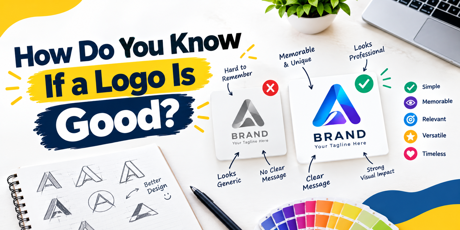
Simplicity is one of the most important factors of a good logo. The simplistic design is easily recognizable and memorable. A logo can be a nightmare when it has too many colors, shapes, fonts, or details.
Take a look at some of the most famous world brands. Most of them use minimalist shapes and colors. People can recognize their designs in seconds. A simple logo doesn’t mean a boring logo.
It Is Easy to Remember
An effective logo must have a definite impact. It should remain visible and memorable. This is especially crucial when a company competes with many similar companies.
A logo can stand out with unique shapes, innovative use of space, and an appropriate symbol. An impressive design doesn’t have to be complex. One powerful visual concept can sometimes be all it takes to create an easy-to-identify logo.
It corresponds to the brand.
A logo must symbolize the business. It must match the company and industry in its colors, fonts, shapes, and style.
For example, a children’s brand can use friendly colors and playful shapes, whereas a law firm might adopt a more formal, professional look. An IT firm may adopt a contemporary, clean look.
Before assessing a logo, ask yourself whether it suits the brand. A beautiful design can be a bad logo if it doesn’t fit the company’s identity.
The Reason for the Colors
Colors can influence how people feel about a brand. Depending on the color, different colors can create different impressions. Blue can signal trust and professionalism, while green often suggests nature, growth, or health. Red can create a powerful, vigorous impression. If you’re unsure whether your design looks professional, you can contact a professional logo designer in Pakistan, and they will help you create a logo that suits your brand and works across various marketing media.
A good logo doesn’t require many colors. You can create an effective design with two or three carefully selected colors. The colors must also be compatible and be readable when the logo is printed or shown on a computer screen.
The Font Is Clear
Logo design is an important area of typography. A logo with text must use an easy-to-read font. Decorative fonts may be visually attractive, but when the logo is small, they can be hard to read.
The font must also fit the brand. A contemporary company can use a clean font, while an innovative brand can opt for something more expressive. The trick is to ensure the style doesn’t reduce readability.
It Fits in Various Sizes
Whether it is big or small, a professional logo should be attractive. It can look great on a large sign and a small social media icon the next day.
A strong design also retains its key information when you resize it. If a logo is blurred, cluttered, or hard to identify when downsized, it may need improvement.
Logos and other designs are usually developed as vectors so you can scale them without compromising quality. This makes the logo usable across various marketing materials.
It looks good in black and white.
One helpful test is to view the logo in black and white. When the design remains readable and recognizable even in black and white, then it tends to be a very basic design.
This test also shows whether the logo relies too heavily on color to convey its idea. The design must still have a definite form and visual identity without depending solely on colorful effects.
It Is Original
A good logo must possess its own identity. It must not replicate another company’s logo. You may use common symbols, but the overall design must be unique.
Creativity helps a business develop a distinct identity. It is also prudent to check whether a similar trademark already exists in the market before using a logo.
It can be used on various platforms.
Businesses use logos in many places. A logo can appear on a web page, Instagram account, email signature, product label, advertisement, or printed sheet.
A powerful design must work across these platforms without compromising its look. It must look professional on both computer screens and in print.
It Conveys the Right Message.
A logo doesn’t have to say everything about a business. Nonetheless, it must make the appropriate overall impression.
For example, a high-end brand might need a sophisticated, classy look, while a sports company might need something dynamic and vibrant. The design should support the message the business needs to convey.
Ask yourself how you feel about the logo. Is it reliable, contemporary, easy-going, innovative, or professional? When the emotion matches the brand, the logo is probably on the right track.
It Is Not Reliant on Trends
Design trends are dynamic. A logo that follows every current trend will look dated after a few years. A good logo tends to be a classic.
This is not to say that the design cannot be updated. When necessary, brands can update their logos. The key identity must, however, be strong enough to act beyond a short-term trend.
It gets the right response.
The last method of judging a logo is to show it to people who know the audience the logo targets. What do they see first of all, and what kind of a business do they believe it is?
When multiple people perceive what you intended and can recall the design, that is a good sign. Their feedback can also reveal issues the designer might miss.
Conclusion
An attractive picture is not a good logo. It must be simple, catchy, legible, innovative, and closely related to the brand. It must also work across various sizes, colors, platforms, and marketing materials.
The most successful logo designs convey a clear identity without needless information. Evaluating these attributes before selecting the final design helps companies develop a visual identity that looks professional and remains relevant over time.