






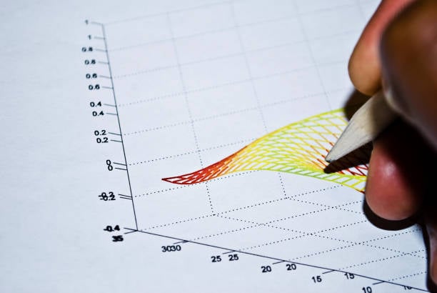
A MATLAB graph can show a lot of information at a glance. But when you are writing a report or assignment, simply inserting the graph is not enough. You also need to explain what the reader is looking at and, more importantly, what the results actually mean.
This is where many students get stuck. They can create a graph in MATLAB, but turning that visual result into a clear paragraph can feel surprisingly difficult.
When I explain a MATLAB plot, I usually start with four simple questions: What is being measured? What changes? What pattern can I see? And why does that pattern matter?
That approach keeps the explanation focused and makes the graph part of the argument rather than just something added to fill a page.
Start by explaining what the graph shows
Before discussing the results, give the reader some basic context. They should immediately understand what the graph is about without having to work it out themselves.
A useful introduction normally tells the reader:
- What type of graph they are looking at
- What the x-axis represents
- What the y-axis represents
- What relationship or result the graph is being used to show
For example, instead of writing:
Figure 1 shows a MATLAB graph.
you could write:
Figure 1 shows how the calculated option price changes as the price of the underlying asset increases.
That one sentence already gives the reader a reason to pay attention to the figure.
MATLAB provides a range of plotting functions for different types of data. The standard plot function is commonly used for two-dimensional line graphs, while functions such as scatter, histogram, and surface plots are better suited to other types of information. MathWorks’ plotting documentation provides examples of the different approaches.
The important thing is to choose a graph that matches the question you are trying to answer.
Explain the axes before discussing the trend
The axes are one of the first things I check when interpreting a MATLAB plot.
Look at the x-axis and y-axis carefully. What does each one measure? Are there units? What range of values is shown? Is the scale linear, logarithmic, or something else?
For example, saying:
The graph increases significantly.
doesn’t tell the reader very much.
A clearer explanation would be:
As the underlying asset price increases from £80 to £120, the calculated call option value also increases, showing a positive relationship between the two variables.
Now the reader knows what is changing and over what range.
MATLAB makes it straightforward to add titles, axis labels, and legends to a figure. These details might seem minor, but they make a big difference when someone else is trying to understand your results. MathWorks’ guidance on titles and labels is a useful reference if you are unsure how to format them.
Don’t forget units either. “Time” is vague. “Time (seconds)” is much clearer.
Don’t just describe the graph interpret it
This is probably the biggest difference between a basic graph explanation and a good one.
There are three stages I find useful:
Describe what you can see
Start with the obvious observation.
The plotted curve rises as the independent variable increases.
Explain what the pattern suggests
Then give the observation some meaning.
This shows a positive relationship between the two variables.
Connect it to your analysis
Finally, explain why the relationship matters.
In the option-pricing model, this means that the call option becomes more valuable as the underlying asset price increases, assuming the other inputs remain unchanged.
That final step is where the analysis really happens.
A graph is evidence. Your writing needs to tell the reader what that evidence means in the context of the problem.
Be specific when describing trends
Try to avoid vague phrases such as:
- “The graph goes up.”
- “There is a big change.”
- “The results are interesting.”
- “The line changes a lot.”
- “The graph shows a relationship.”
These statements aren’t necessarily wrong, but they don’t tell the reader enough.
Instead, look for the actual pattern.
You might notice:
- An upward or downward trend
- A peak or minimum
- A sudden change
- A plateau
- A turning point
- A nonlinear relationship
- Increasing or decreasing variability
- A group of unusual observations
- Two lines moving further apart
- Two lines becoming closer together
For example:
The response increases quickly at lower values of x, but the rate of increase gradually slows as x approaches 10. This suggests a nonlinear relationship between the two variables.
That’s much more useful than saying the line “goes up.”
At the same time, be careful not to claim something the graph cannot actually prove. If two variables move together, that does not automatically mean that one causes the other.
Use numbers when they actually help
A graph gives you an opportunity to make your explanation more precise.
If the reader can clearly see an important value or range, include it in the discussion.
For example:
The output increases from approximately 20 units at t = 0 to around 75 units by t = 10.
You can then explain what that change means:
The rapid increase during the first 10 seconds suggests that the system responds strongly at the beginning of the simulation before moving towards a more stable level.
Don’t feel that you need to mention every number shown on the graph. That usually makes the writing harder to read.
Choose the values that help support your main point.
Explain peaks, minimums and turning points
If the graph has an obvious maximum or minimum, it is usually worth mentioning.
For example:
The curve reaches a maximum at approximately x = 4.5 before gradually declining.
If the value is important, you can include it:
The response reaches a maximum of approximately 2.8 when x is around 4.5.
There is one important caution here: don’t report more precision than the graph or underlying data can support.
If you can only reasonably read a value as approximately 2.8 from the figure, there is little point writing 2.834927 unless that level of precision is supported by the original calculation.
When there are several lines, focus on the comparison
MATLAB is often used to put several data series on the same graph. This can be useful because it allows you to compare different models, scenarios, or parameter values.
But it can also make your explanation unnecessarily complicated.
You don’t need to describe every line separately.
Start by explaining what is being compared:
Figure 3 compares the predicted values from Models A, B and C across the selected range.
Then focus on the differences that actually matter:
Model A produces the highest values across most of the range, while Models B and C remain relatively close until approximately x = 50. After this point, the difference between the models becomes more noticeable.
That tells the reader what they need to know without walking through the graph line by line.
If you use multiple lines, make sure your legend clearly identifies them. MATLAB’s legend function is designed for this purpose, and MathWorks’ documentation explains the available options.
Don’t ignore uncertainty
Some MATLAB graphs include error bars, confidence intervals, standard deviations, or other indicators of uncertainty.
If yours does, explain what they represent.
For example:
The error bars show the variability around the mean values. Although the second group has a higher mean than the first, the overlap between the uncertainty intervals means that the difference should be interpreted with caution.
Simply writing “error bars are included” doesn’t really help the reader.
The uncertainty is part of the result, so it belongs in the explanation.
This is particularly important in scientific and statistical work, where a visible difference between two values does not necessarily mean that the difference is statistically meaningful.
Make the MATLAB figure easy to read
Before worrying about how to describe your graph, make sure the graph itself is actually readable.
I would check:
- Are both axes labelled?
- Are the units included?
- Does the title tell the reader what the figure is about?
- Is the legend clear?
- Can you easily distinguish the different lines or markers?
- Is the text large enough?
- Are the colours easy to distinguish?
- Is there unnecessary decoration?
- Can the graph still be understood when it is placed in your report?
Colour deserves particular attention. If two lines are distinguished only by red and green, for example, some readers may have difficulty telling them apart.
A good figure should still make sense without relying entirely on colour.
For more detailed guidance, Nature’s figure preparation recommendations cover issues such as legibility, colour, sizing, and figure presentation.
Write a useful figure caption
A caption should tell the reader what the figure represents. It shouldn’t just repeat the word “graph.”
Compare these two captions:
Figure 4: MATLAB graph.
and:
Figure 4. Effect of underlying asset price on European call option value. The calculated option value increases as the underlying asset price rises, while the remaining pricing parameters are held constant.
The second caption is much more useful.
For a simple figure, the caption can be short. For a more complicated figure, you may need to explain different panels, symbols, or abbreviations.
The goal is to make the figure understandable without forcing the reader to search through several paragraphs to work out what they are seeing.
A simple method for writing about MATLAB graphs
When I’m turning a MATLAB graph into written analysis, I find it helpful to follow four steps.
Step 1: Identify
Tell the reader what the graph measures.
Figure 1 shows the relationship between time and system output.
Step 2: Describe
Point out the main pattern.
The output initially increases rapidly before approaching a relatively stable level.
Step 3: Quantify
Use a useful number or range if the graph supports it.
The output increases from approximately 20 units at t = 0 to around 75 units by t = 10.
Step 4: Interpret
Explain what the pattern means.
This suggests that the system responds quickly at the beginning of the simulation before approaching a steady-state response.
This four-step approach is simple, but it prevents one of the most common problems in technical writing: spending an entire paragraph telling the reader what the line looks like without explaining why it matters.
Example: explaining a MATLAB graph in an options-pricing assignment
Imagine you’ve used MATLAB to calculate the price of a European call option for different underlying stock prices.
A weak explanation might look like this:
The graph shows that the option price increases as the stock price increases. The line goes up and the graph is curved.
Technically, that may be true. But it doesn’t tell the reader much.
A stronger explanation would be:
Figure 1 shows the relationship between the underlying stock price and the calculated European call option value. The option value increases as the stock price rises, showing a positive relationship between the underlying asset and the value of the call. The curve is nonlinear, so the rate at which the option value changes is not constant across the full price range. This behaviour is consistent with the sensitivity of a call option to movements in the underlying asset, while the other pricing assumptions remain unchanged.
Notice the difference.
The second version doesn’t simply describe the shape of the line. It connects the MATLAB result to the financial concept being investigated.
That’s particularly important when your MATLAB graph is part of a financial modelling, derivatives pricing, sensitivity analysis, or numerical methods assignment.
If you’re struggling to connect the MATLAB output to the underlying financial theory, best derivatives pricing options writing help may also be useful as a specialist resource. However, the final explanation should still demonstrate your understanding of the model and the result rather than simply presenting a graph without analysis.
Export the figure properly
One final issue that is easy to overlook is the quality of the exported figure.
A graph can look perfectly clear inside MATLAB and then become tiny or blurry when you paste it into Word or another document.
MATLAB’s exportgraphics function gives you more control over how figures are exported, including resolution and output format. MathWorks’ export guidance explains how to prepare figures for use in documents.
For example:
exportgraphics(gca,"myplot.png",Resolution=300)
A 300 DPI raster image can be suitable for many documents, while a vector format such as PDF may be preferable when you need the graphic to remain sharp at different sizes.
Don’t automatically choose the biggest file or highest resolution, though. Check your university or publisher’s requirements first.
Common mistakes to avoid
A few problems appear again and again when students explain MATLAB graphs.
Describing instead of analysing
“The line increases” is an observation. Tell the reader what the increase means.
Forgetting units
A number without a unit can be difficult to interpret.
Repeating everything visible in the graph
Your paragraph should add something to the figure rather than simply reading it aloud.
Claiming causation
A graph can show a relationship without proving that one variable causes another.
Using too much technical language
The explanation should be understandable to the intended reader, not just someone who already knows MATLAB.
Reporting excessive precision
Don’t quote more decimal places than your data or graph can reasonably support.
Forgetting why the graph exists
Before you finish, ask yourself: What is the reader supposed to learn from this figure?
That question often reveals what is missing from the explanation.
A quick checklist before you submit
Before submitting a report containing MATLAB figures, I would run through this checklist:
- Have I explained what both axes represent?
- Have I included units where necessary?
- Have I identified the main trend?
- Have I mentioned any important peaks, turning points, or unusual results?
- Have I used numbers where they strengthen the explanation?
- Have I explained what the pattern means?
- Have I connected the result to the purpose of the analysis?
- Have I avoided making claims the graph cannot support?
- Is the caption informative?
- Are the labels and legend readable?
- Does the exported figure still look clear in the final document?
If you’ve covered those points, your graph is doing more than taking up space on the page. It is supporting your argument.
The aim is to explain the result, not just describe the picture
The easiest way to think about MATLAB graph interpretation is to stop treating the figure as the final answer.
The graph is the evidence. Your writing is what helps the reader understand that evidence.
Tell them what the figure shows. Point out the pattern that matters. Use numbers when they add something useful. Then explain why the result matters in the context of your work.
That’s what turns a basic graph description into proper analysis.