



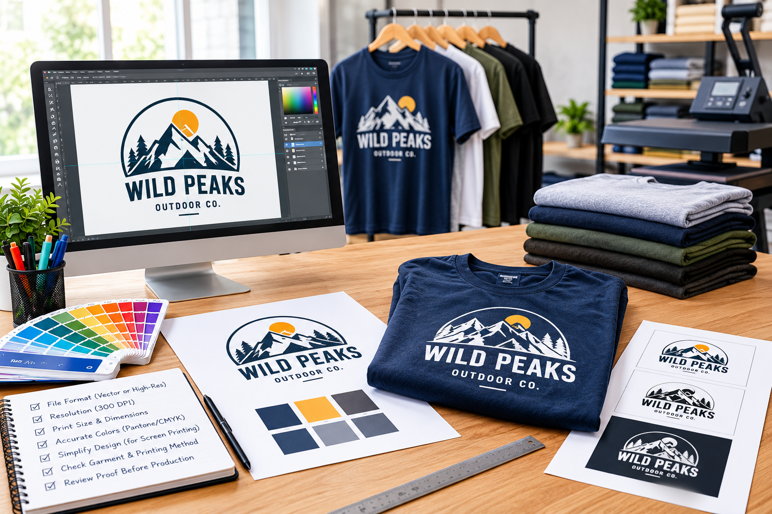
High-quality apparel printing starts long before ink touches fabric. Whether you are creating branded T-shirts, employee uniforms, promotional merchandise, or custom hoodies, properly prepared artwork helps ensure that your design looks sharp, professional, and consistent across every garment. Even a great logo can lose its impact when the file is blurry, colors are inaccurate, or important details are too small to reproduce clearly.
Understanding how to prepare artwork for printing also makes the production process smoother. It helps reduce avoidable revisions, supports consistent branding, and allows your printing partner to select the right production method for your design.
In this guide, we will explain the essential steps for preparing print-ready artwork and getting better results from professional apparel printing.
1. Choose the Right Artwork File Format
The first step is selecting a file format that preserves the quality of your design. Not every image that looks good on a computer screen is suitable for printing on clothing.
Vector formats, including AI, EPS, SVG, and vector PDF, are generally preferred for logos and illustrations. They use mathematical paths rather than fixed pixels, allowing the artwork to be resized without losing sharpness. This is particularly useful when the same logo needs to appear on a small chest print and a larger design on the back of a shirt.
Raster formats, such as PNG, JPEG, and TIFF, are made from pixels. They can also produce excellent results when supplied at an appropriate resolution and size. For many digital printing applications, a PNG with a transparent background is a practical option.
Avoid relying on screenshots, compressed social media images, or small logos downloaded from websites. These files may contain insufficient detail for professional production. If you only have a low-quality image, ask your printing provider whether it can be recreated or converted into suitable artwork before proceeding.
2. Set the Correct Resolution and Print Dimensions
Resolution directly affects how clearly a raster image reproduces on fabric. An image may appear perfectly acceptable on a phone but become visibly pixelated when enlarged for a garment.
For most raster artwork, 300 pixels per inch (PPI) at the intended print size is a useful target. Remember that resolution and dimensions work together: a small image does not automatically become high-quality artwork simply because its resolution setting is changed.
For example, a logo intended for a four-inch chest print needs enough actual pixels to maintain clean edges at that size. If the same logo will be enlarged for a twelve-inch back print, the original file must contain sufficient detail for the larger dimensions.
Before submitting your design, specify the intended print width and height, along with its placement on the garment. A left-chest logo, sleeve graphic, and full-back design each require different dimensions and proportions.
Correct sizing helps your printer prepare the artwork accurately and reduces the likelihood of unexpected adjustments during production.
3. Prepare Colors for Accurate Printing
Colors are a major part of brand identity. A company logo that appears in the wrong shade can make uniforms and promotional apparel look inconsistent with other marketing materials.
Start by identifying your official brand colors. If your organization uses specific Pantone references, include them when submitting artwork for screen printing. These references help communicate your intended colors more precisely than descriptions such as dark blue, bright red, or forest green.
Digital designs commonly use RGB color values, while printed artwork may be prepared using CMYK or specific spot colors, depending on the printing method. Converting between color systems can change the appearance of certain shades, so colors displayed on a monitor should not be treated as a guarantee of the final printed result.
It is also important to consider garment color. A light-colored logo may need an appropriate underbase when printed on dark fabric, depending on the ink and production process.
For the most reliable outcome, provide brand color references and review a digital proof before production. If color accuracy is especially important, discuss whether a physical sample or print test is appropriate for your order.
4. Simplify Artwork for Professional Screen Printing
Screen printing is a popular option for custom apparel because it can produce bold, durable designs and consistent results across larger quantities. However, artwork must be prepared with the printing process in mind.
Each spot color in a conventional screen-printed design generally requires its own screen. Consequently, the number of colors can affect setup requirements, production complexity, and overall cost.
For this reason, review whether every color and visual detail contributes to the design. Simplifying unnecessary elements can make artwork easier to reproduce without sacrificing brand recognition.
Pay particular attention to tiny lettering, narrow lines, overlapping shapes, and intricate details. Features that look distinct on a large monitor may merge, disappear, or become difficult to read when printed at a smaller size. The practical limits depend on the artwork, mesh, ink, fabric, and printing technique, so ask your provider to review any particularly detailed design.
For screen printing, organized vector artwork and clearly defined spot colors are helpful starting points. Text should generally be converted to outlines when required by the printer, preventing font substitutions or unexpected changes to lettering.
Working with professional screen printing services can help identify these issues before production begins and ensure the artwork is suitable for the intended garment.
5. Match the Artwork to the Garment and Printing Method
Not every design works equally well on every fabric or with every printing technique. Before finalizing artwork, consider the garment material, color, intended use, and complexity of the design.
For example, a simple logo with a limited number of colors may be well suited to screen printing, particularly when producing multiple shirts for a business or event. Detailed, multicolored artwork may be better suited to a digital printing or transfer method, depending on the fabric and desired finish.
Placement also matters. A logo intended for a polo shirt should be sized differently from artwork intended for a hoodie, work jacket, or oversized T-shirt. Consider how seams, pockets, garment folds, and the natural shape of the clothing may affect visibility.
These decisions are especially important when planning custom logo printing for apparel. A design should remain recognizable and visually balanced across the different garment styles in your order.
Businesses ordering uniforms should also consider consistency. Establishing approved artwork versions, placement dimensions, and brand colors makes future reorders easier to manage and helps employees present a unified appearance.
6. Review Your Proof Before Approving Production
The final artwork review is your opportunity to catch mistakes before they become expensive production problems. Even a technically correct file can contain an incorrect logo version, spelling error, unsuitable placement, or color choice that does not match your expectations.
Before approving a proof, check the following:
- Logo accuracy: Confirm that the correct logo, wording, and brand elements are included.
- Dimensions: Verify the print size and its position on the garment.
- Colors: Compare the artwork against your brand references and confirm any necessary color-matching requirements.
- Readability: Make sure small text and fine details remain clear at the intended size.
- Garment compatibility: Check that the design works with the selected fabric and garment color.
- Order consistency: Confirm that the approved artwork will be used across all relevant sizes and styles.
A digital mockup helps you understand how the design may look on the finished garment, but it is not a substitute for checking the production-ready file. Ask your printing partner to explain any limitations or recommended adjustments before giving final approval.
For companies seeking dependable business apparel printing solutions, this review process helps protect brand consistency and makes it easier to coordinate repeat orders, staff uniforms, and promotional campaigns.
Conclusion
Preparing artwork correctly is one of the most important steps toward achieving professional apparel printing results. By choosing suitable file formats, maintaining adequate resolution, defining colors carefully, simplifying complex designs, and reviewing the final proof, you can avoid common problems and give your printing provider a stronger starting point.
The best approach is to plan the artwork around the garment and printing method rather than treating the design file as an afterthought. When you are unsure about file requirements or design limitations, ask your printing partner for guidance before production begins.
With careful preparation and the right production support, your branded apparel can deliver a clean, consistent appearance that represents your business with confidence.