




Moving from a 10×10 to a 10×20 feels like a big step. You double your floor space, and with it your budget, shipping and staffing. Yet on many show floors, the extra 100 square feet doesn’t produce twice the results. It produces a booth that is bigger but not better.
The reason is rarely the space itself. It’s how the space is planned, and, for rental exhibitors, how the rental package is chosen. This guide covers the most common mistakes exhibitors make with a 10×20 trade show booth rental, why they cost traffic and budget, and what to do instead.
What a 10×20 booth really gives you
A 10×20 booth is 200 square feet, usually 10 feet wide and 20 feet deep, or the reverse. Whether it is an in-line booth between neighbours, a corner booth with two open sides or a peninsula changes the layout enormously. A corner booth gets visitors from two directions. An in-line booth has one open front and a long, narrow shape that is easy to waste.
Before anything else, confirm your booth type and the show’s rules in the exhibitor manual. Height limits, back wall rules and sightline requirements near neighbouring booths vary by show and venue, and they decide what a design can include.
Mistake 1: Treating it as two 10x10s joined together
The easiest way to plan a 10×20 is to take a design that worked in 10×10 and stretch it. The result is usually a long back wall, a table across the front and a lot of empty carpet in the middle.
A 10×20 needs its own plan. The extra depth is an opportunity to create different areas, such as a demo space and a meeting space, which a smaller booth can’t fit.
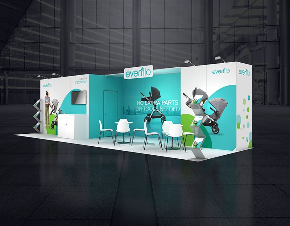
Do this instead: Plan a 10 x 20 booth design around two or three purposes, then divide the space accordingly. A common approach is a visible, open front for attraction and demos, with quieter conversation space further back.
Mistake 2: Filling every inch
When exhibitors suddenly have more space, they often add more: extra furniture, more products, more banners, more screens. The booth ends up looking crowded, and visitors can’t tell where to look or where to enter.
The extra floor space is most valuable as breathing room. Open space makes a booth look premium and makes it easy for visitors to step in without feeling committed to a conversation.
Do this instead: Leave deliberate gaps. If a piece of furniture or display doesn’t support your main goal, remove it.
Mistake 3: A wall of tables across the front
This mistake carries over from smaller booths, but it hurts more in a 10×20. A long counter across the aisle edge acts as a barrier that discourages entry, and it hides the 200 square feet behind it.
Do this instead: Pull counters to the side or angle them. Keep the front open, with demos or displays visible but not blocking the entry. Many modern booths now skip the traditional reception desk entirely and design the entry around visitor flow instead.
Mistake 4: No clear zones
A 10×20 booth without defined zones feels like one large room with no purpose. Visitors can’t tell which part is for browsing, which is for talking and which is private.
Do this instead: Define zones by purpose, using flooring changes, lighting, partial walls or furniture grouping:
- Attract zone at the front, with a demo, product or visual hook.
- Engage zone in the middle, with a counter, screen or product trial.
- Meeting zone at the back or side, with seating for longer conversations.
This is often the biggest single difference between booths that work and booths that merely look large.
Mistake 5: Putting all the messaging at eye level
With more width and depth, many exhibitors spread text and graphics across the whole back wall at standing height. Visitors approaching from down the aisle can’t read it, and the booth blends into its neighbours.
Do this instead: Use height where the rules allow it. Put a strong headline and logo above eye level, visible from a distance, and detail at eye level for visitors who come closer. Check height restrictions before the design is finalised.
MistaCke 6: hoosing 10×20 trade show booth ideas that need a bigger crew than you have
A creative layout with a demo area, a lounge and a reception counter sounds impressive. It also requires staff to manage each area. If you plan to bring three people, a four-zone booth will leave two zones empty, and an empty zone makes the whole booth look quiet.
Do this instead: Match the design to your team. As a rough guide, plan each active zone around at least one person, and cover breaks and lunch. If your team is small, choose a simpler layout with one strong focal point.
Mistake 7: Not checking what the rental package includes
This is often the most expensive mistake in a 10×20 trade show booth rental. Rental prices can look attractive, but the package may include only the frame and basic graphics. Items that frequently sit outside the base price include:
- Custom or double-sided graphics
- Flooring and carpet
- Lighting and electrical
- Furniture and storage
- Counters, screens and AV
- Installation and dismantle labour
- Shipping, drayage and storage between shows
- Damage and replacement terms
Do this instead: Ask for an itemised quote and compare line by line. Ask specifically about graphics: what is included, how many changes are allowed, and whether graphics can be reused at a later show. For US venues, ask how installation and dismantle labour are handled, since venue rules and labour arrangements differ. Material handling (drayage) charges in particular can vary widely between cities and venues, so ask for an estimate rather than assuming.
Mistake 8: Approving the design from a single image
A flat rendering can make any 10×20 booth look good. It rarely shows how visitors will walk through the space, where they will queue or whether sightlines work from the aisle.
Do this instead: Ask for eye-level views and a plan view, and for larger or more complex layouts, a walkthrough. Photoreal renders are best for judging look and materials, while VR or interactive walkthroughs are better for testing flow and scale. Neither confirms that a structure is buildable, so ask for technical drawings separately.
Mistake 9: Deciding too late
Rental booths can feel quick to arrange, so exhibitors leave graphics, approvals and show-service orders to the last few weeks. Then they pay rush fees, accept limited options or miss show deadlines for electrical and lighting orders.
Do this instead: Work backwards from show dates. Confirm the booth type and rules first, then the design, graphics and show-service orders, leaving a buffer for approvals and shipping. If you exhibit in more than one region, remember that the same booth can be a very different project in different cities, with different rules, labour practices and costs.
Mistake 10: Choosing a supplier on price alone
A low quote isn’t necessarily a good deal, and a high quote isn’t necessarily a better one. What matters is what you are getting and who is accountable on show day.
Before you sign, look for these warning signs:
- Vague or lump-sum quotes with no breakdown
- No clear point of contact for show day
- Reluctance to show past work, references or drawings
- Pressure to confirm before you’ve seen the design
- Unclear terms for damage, changes and cancellations
Four 10×20 trade show booth ideas that use space well
These are starting points, not templates. The right one depends on your goal and your booth type.
- The open demo booth: a clear front, a product or demo visible from the aisle, and a counter set to one side. Good for product-led companies.
- The meeting-first booth: a compact front display with a seating area at the back for longer conversations. Good for sales-led and B2B services.
- The gallery booth: a narrow row of display plinths or product stations along one side, with a walkway on the other. Good for brands with several products.
- The split booth: a visible attraction area, a mid-booth demo and a small private meeting corner. Good for teams of four or more.
If you’re comparing options for 10 x 20 booth displays, the right choice is the one your team can staff and your visitors can read in a few seconds.
A quick checklist before you sign
Before confirming a 10×20 trade show booth rental, make sure you can answer yes to each of these:
- Do I know my booth type and the show’s height and sightline rules?
- Is my layout planned around two or three clear purposes?
- Is the front open, with space visitors can walk into?
- Are zones defined by function, not just furniture?
- Do I have enough staff to run every zone?
- Do I have an itemised quote showing graphics, flooring, lighting, power and labour?
- Have I seen eye-level views or a walkthrough of the design?
- Do I know the deadlines for graphics and show services?
- Is it clear who is responsible on install day and during the show?
Summary
A 10×20 booth isn’t simply a bigger 10×10. It gives you room to create zones, leave space to breathe and host different types of conversation, but only if the space is planned deliberately. Most wasted space comes from the same few causes: stretching a small-booth plan, filling every corner, blocking the entrance and under-checking the rental package.
Before your next show, walk the planned layout as a visitor would, from the aisle, and ask whether you could tell what the booth offers within a few seconds. If you couldn’t, the space isn’t working yet.